
In my last column, we considered the drivers of surging inflation and why they may prove to be longer-lasting instead of “transitory”. So far, this has proved to be prescient analysis. Inflation has continued to surprise to the upside.
In this column, we’ll explore the effects of high inflation on equities, what this means for equity investors and investors holding a “balanced” portfolio.
Our focus will be on the United States. The US is world’s largest economy and it has the world’s largest equity market. Its economy and financial market have an outsized impact on markets around the world. It is also relatively easy to access long-term data on the US financial markets and economy.
There has been only one period with persistently high inflation (i.e. core inflation above six per cent) in the last 50 years – the period from 1974 to 1982. A lot has changed since the 1970s. We’ll consider some important caveats to the data presented below at the end of the column.
This column is quite data intensive and full of charts. Not everyone finds charts easy to interpret. Here’s a summary for readers that would like to skip the charts:
- High inflation is kryptonite for equity valuations.
- Earnings do increase with inflation, but it’s not a 1:1 relationship.
- Dividends failed to keep up with inflation.
- Real returns for stocks were horrible.
- Stocks and bonds can become positively correlated, rendering traditional multi-asset diversification ineffective.
- Points 1 and 2 mean the effects of high inflation are likely to be much worse for growth (i.e. expensive valuation) and speculative (i.e. no earnings) stocks.
Our first chart shows US inflation (rolling 12-month rate-of-change in Core CPI, top) and the valuation of US stocks (S&P 500 trailing 12-month price-to-earnings ratio, below) over the last 50 years to the end of January 2021.
Inflation was below six per cent (red line) for the majority of this period. The exception was the period from 1974 to 1982 (highlighted in red). The charts that follow focus on this period.
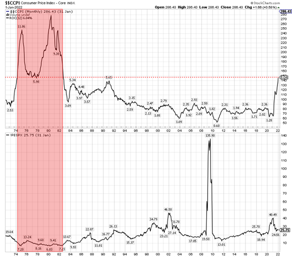
The S&P 500 had a single-digit price-to-earnings ratio for most of the high inflation period. Notice too that inflation and valuation are negatively correlated. The rolling three-year correlation between inflation (Core CPI Index) and valuation (trailing 12-month price-earnings ratio, bottom) was negative for most of the period.
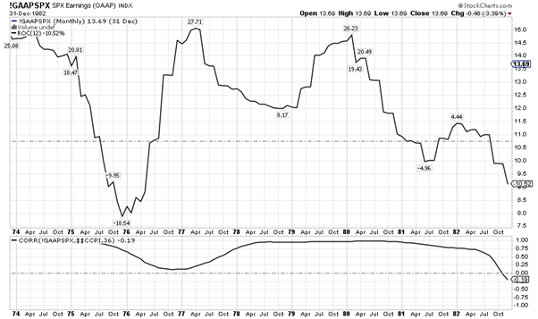
What about corporate earnings? Most investors believe that earnings should rise with inflation. They assume that companies can pass on cost increases to their clients.
The chart below shows the rolling 12-month rate-of-change for S&P 500 earnings (12-month trailing GAAP, top). The bottom panel of the chart shows the rolling 3-year correlation between S&P 500 earnings (12-month trailing GAAP) and inflation (Core CPI Index).
The correlation between earnings and inflation is positive over the long-term. That said, there was a multi-year stretches when the correlation between earnings and inflation was weak.
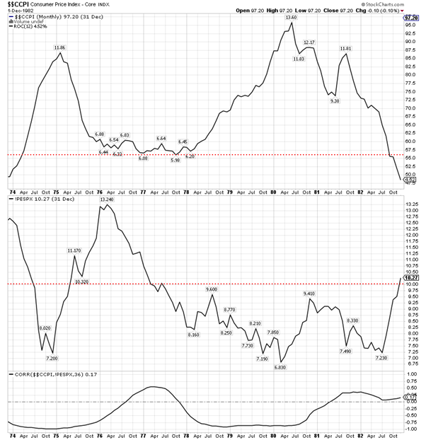
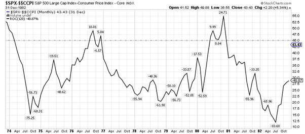
Dividends were higher, thanks to lower valuations. Unfortunately, dividend yields were still lower than inflation rate for most of the period. The increase in dividend income failed to offset the effects of higher living costs and the erosion of purchasing power. The chart below shows inflation (12m rate-of-change in Core CPI, top) and the S&P 500 dividend yield (trailing 12-months).
The next chart puts the pieces together. It shows the rolling ten-year real (i.e. minus inflation) returns for US stocks (S&P 500 Price Index[1]).
What a horrible chart.
Rolling ten-year equity returns were diabolical! Even after adding back dividends, shareholders suffered an enormous loss of real (i.e. inflation-adjusted) wealth.
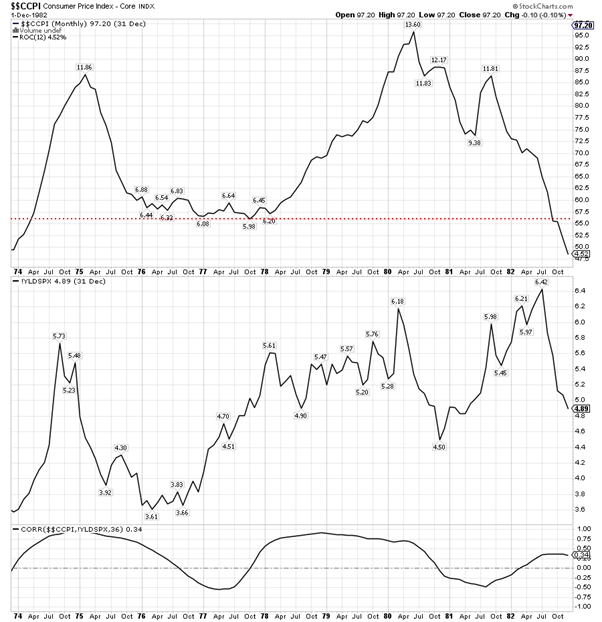
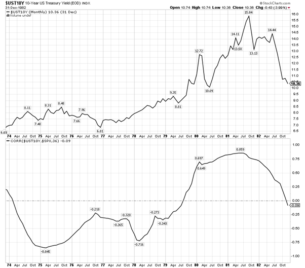
Multi-asset investors also had to cope with the fact that equities became positively correlated with bonds. The chart below shows the 10-year US Treasury yield (top) and the correlation between this yield and equities (rolling 3-year correlation with the S&P 500 Index), bottom). The correlation between stocks and yields was persistently negative for the majority of the period. This means that the correlation between stocks and bonds was positive, as yields have an inverse relationship with bond prices.
A positive correlation between stocks and bonds blunts the effectiveness of diversification. It means that both sides of a “balanced” portfolio rise and fall at the same time, instead of smoothing the ride by offsetting each other.
Now for the caveats. It’s unwise to draw definitive conclusions form a single country or period of history. It is also unwise to extrapolate the lessons of history when so much has changed. For example:
- Investor base (i.e. institutions vs retail investors as the dominant market players)
- Rise of passive (i.e. index) investing
- Technology
- Demographics
- Sector and industry composition of the equity market
- Regulation (e.g. Reg FD)
- Taxes (e.g. the relative attractiveness of dividends vs buybacks)
On the other hand, it’s also unwise to dismiss history as meaningless. Especially when the majority of investors in the market, myself included, suffer from a generational blindspot when it comes to investing in a period of high-inflation.
This column is not a forecast. It’s a reminder of what happened to US equities during the last period of prolonged inflation. The lessons from this period may or may not apply this time. Each investor will have to weigh the small historical sample against what has changed and come to their own conclusions.
We haven’t considered point #6 in the summary at the beginning of this column. It was the opinion that is reasonable to expect that growth and speculative stocks will suffer a bigger impact from the effects of high-inflation. This will be the focus of my next column.
[1] Unfortunately, I didn’t have data for the S&P 500 Total Return Index going back to the 1970s. Consequently, the chart ignores dividends and therefore understates the total return earned by equity investors. Dividends helped, but they didn’t save investors from horrible returns.
__________
[i3] Insights is the official educational bulletin of the Investment Innovation Institute [i3]. It covers major trends and innovations in institutional investing, providing independent and thought-provoking content about pension funds, insurance companies and sovereign wealth funds across the globe.